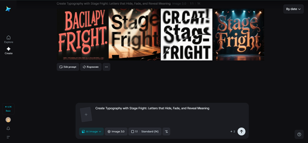
Typography with Stage Fright: Letters that Hide, Fade, and Reveal Meaning
Not every letter is a total attention seeker. Some letters are wedged in atmosphere — flickering at the edge of our perception, some letters make guest appearances in static or disappear partway through a sentence, and others may dribble out, like shy performers on a darkened stage. This is typography that experiences stage fright — a new trend in which fonts don't just communicate, they put on a show.
In an age of boisterous branding and infinite scrolling, quiet and tentative typography has won us over. These compositions stutter, hesitate, or disappear — compelling the viewer to move closer. They evoke mystery, closeness, and antics, demonstrating that silence can sometimes speak louder than volume. Thanks to Dreamina's AI photo generator, designers are now able to experiment with this dramatic subtlety with dreamlike accuracy — composing words that seem to breathe, blink, or blush across a page.
The theatre of type
Typography always had personality — loud fonts yell, serifs whisper, scripts dance. But the new evolution of type design introduces motion, mood, and vulnerability. Fonts now perform. They tremble like nervous performers, fade like memories, or pulse like a heartbeat before finally displaying their complete form.
This type of design is not simply about legibility. It's about feeling. When a letter disappears half way through a word, or a sentence trembles like candles, it turns reading into an experience. The reader doesn't simply interpret the message — they sense it unfold.
Brands that are looking for emotional narrative use this typographic theatre to communicate tone in ways that go beyond language. It's not a matter of selling something — it's a matter of bringing the viewer into a kind of collective performance.
When words become movement
Typography that conceals or falters excels in visual tension. It gains strength from imperfection — from hesitation before clarity. This veil of visibility becomes narrative itself.
Some designers employ animated sequences in which words flicker in and out of existence like ghosts of meaning. Others rely on static images that offer the same fragility — blurred edges, half-erased strokes, irregular spacing. The effect comes across as alive, human, and self-conscious in the best possible way.
This is why this style resonates so deeply:
- It instills curiosity. Audiences naturally lean in to fill in what's omitted.
- It creates closeness. The typography is intimate, as if a whispered secret.
- It disrupts predictability. Rather than presenting text immediately, it makes discovery part of the process.
- It conveys emotion. A font that is disappearing conveys nervousness; a font that is appearing conveys optimism.
Typography that is nervous sounds like shyness in a contemporary audience — it's guarded, self-conscious, and it is beautiful.
Providing direction for your typographic exploration with Dreamina
Dreamina makes it an experiential design process in which you're not simply designing, you're rehearsing performances in the form of text. You can experiment with texture, light, and a soft movement using generative tools, and create words that have the movement of a shy performer entering the stage for their cue.
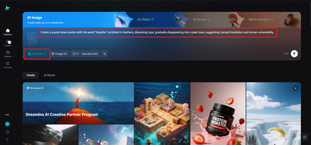
Step 1: Write a descriptive text prompt
Go to Dreamina and write a text prompt that reflects your typographic mood. The key is to imagine in emotional terms — atmosphere, material, tone, rather than appearance.
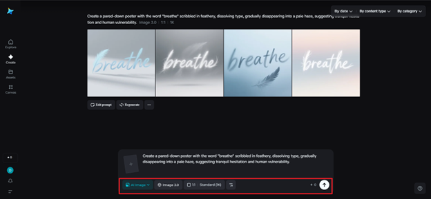
For example: a pared-down poster with the word "breathe" scribbled in feathery, dissolving type, gradually disappearing into a pale haze, suggesting tranquil hesitation and human vulnerability.
By visualising your request, Dreamina brings your typography's personality to life, complete with tremors, fades, and dramatic pauses.
Step 2: Adjust parameters and generate
Next, set your creative conditions. Choose the model that best represents your taste — crisp realism for photographic images or artistic rendering for painterly type. Set the aspect ratio relative to your layout — portrait perhaps for a poster or square for social. Then select your resolution — either 1k or 2k — to suit your quality and texture fidelity preferences. When you are ready to create your visual, click Dreamina's icon.
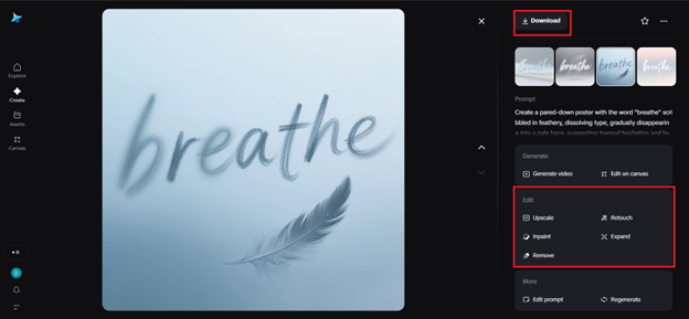
Step 3: Refine and download
Once your image has been produced, you can enhance its performance by utilizing Dreamina's advanced customization capabilities, including inpaint to partially erase letters, expand to make more room for your text, remove to eliminate distracting background noise, or retouch to gently blur or fade your typography for emotional resonance. When you favor the atmosphere - fragile yet complete - press the "Download" button so you can download your artwork.
The outcome will be like a whisper captured on canvas — tentative, haunting, and very human.
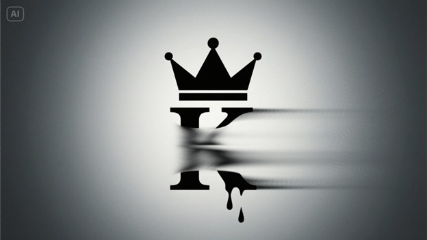
The shuddering beauty of flaws
Design once pursued perfection — crisp grids, sharp corners, authoritative alignment. Now, however, imperfection is more truthful. A letter that is out of balance or has worn typography conveys genuineness, humanity, and frailty. It reminds us that communication is never perfect — and that's what makes it meaningful.
The AI logo generator is a wonderful friend in this regard, particularly when crafting brand identities that celebrate this shaking look. A logo that gradually dissolves in, slowly drops its layers, or even drops faint ghost trails, can convey emotional richness in a manner rigid marks are incapable of. This aesthetic is perfect for emotive, creative, or thoughtful brands — those that don't have to yell in order to be remembered.
Typographers can also try their hand at texture typography — employing cracked paint, water spots, or wisps of smoke as lettering. The letters appear to occupy a half-presence/half-absence status, suspended in their own performance.
The poetry of hesitation
Stage fright typography reminds us that design isn't always confident. Sometimes it's about vulnerability, rhythm, and restraint. These fading, flickering letters make it okay for brands and makers to be unsure — to hesitate rather than perform.
Dreamina's AI image editor offers you a painter's command of digital imperfection. You can play with micro-details — modifying the intensity of film grain, applying soft vignette-like shadows, and mixing in paper-like texture, all in modern compositions. You can even warm up the highlights for a sun-faded look or soften the edges for the vintage bleed look. The editor works intuitively, almost like aging your own digital canvas — you are in control of how much history your image bears.
In an oversaturated world of clarity and perfection, this typographic design honors the virtue of almost being lost but still visible. It's a near-silence language — a gesture, not a statement.
Conclusion
Dreamina makes that a reality — translating emotive concepts into visual theatre. Its smart tools and creative sensibility enable designers to probe the soft, quivering rim of typography — where words don't simply materialize, but appear.
Because sometimes the strongest thing a letter can do is pause — just long enough to be remembered. Dreamina assists makers in choreographing emotion via design — providing even the most timid letters with their moment in the spotlight.
(Disclaimer: Devdiscourse's journalists were not involved in the production of this article. The facts and opinions appearing in the article do not reflect the views of Devdiscourse and Devdiscourse does not claim any responsibility for the same.)